Imagine your logistics team shipping thousands of dollars in products to outdated customer addresses, all due to a data entry error that occurred six months ago. Or picture your inventory system showing popular items as “in-stock” when the warehouse is actually empty, leading directly to customer frustration and cancelled orders.
These aren’t just minor hiccups; they are the costly, real-world consequences of poor data.
In today’s business landscape, data quality is essential. Every organization relies on information for its most critical decisions, but without fundamental trust in their data, every step forward is a gamble.
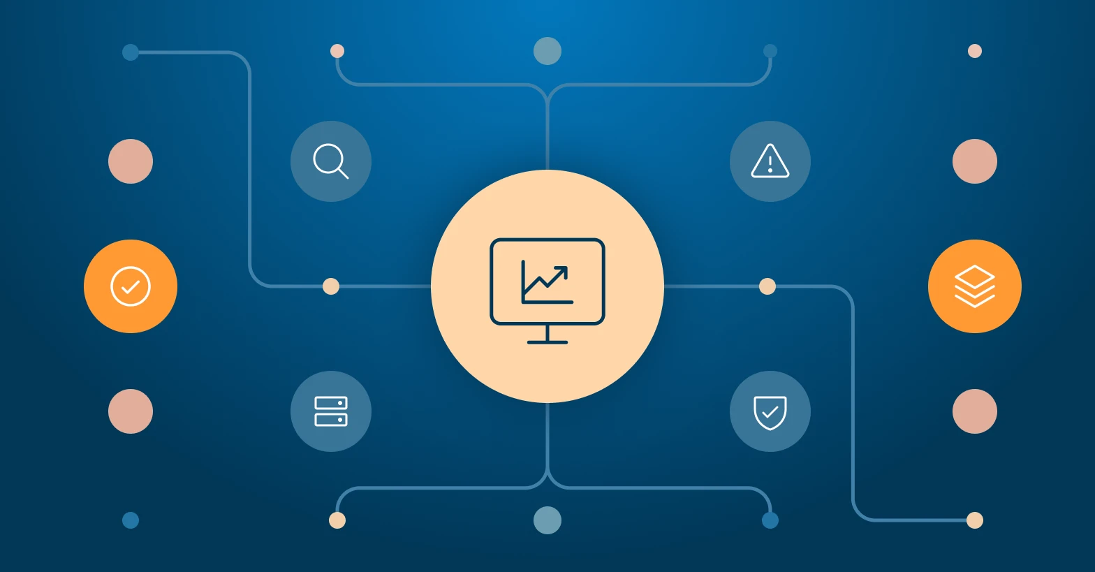
This is where a data quality dashboard becomes your most crucial asset.
Think of it not just as a report, but as the command center for the health of your data – a centralized, visual capability that provides a constant overview of your data’s integrity.
It’s the tool that allows you to stop reacting to problems and start preventing them.
This guide will provide a practical framework for building an impactful dashboard, helping you turn raw information into tangible value and drive continuous improvement across your business.
Key takeaways
Shift from projects to a program
Understand that true data quality assurance is not a one-time assessment but a continuous program focused on long-term prevention and improving data integrity.
Build a proactive defense
A robust assurance strategy creates layers of defense, from validating data at its source to enforcing a single source of truth to ensure data accuracy.
Embrace “Data Quality as Code”
The most effective approach is to treat quality checks as code, automating them within your data workflows for real-time monitoring and prevention.
Anchor your efforts in data governance
A successful program is built on a strong data governance foundation, which provides the essential rules, processes, and human accountability needed to maintain reliable data.
What is a data quality dashboard and why is it a crucial business asset?
At its core, a data quality dashboard is a centralized, user-friendly visualization tool designed for one clear purpose: to continuously monitor and track the quality of your data. It translates complex, automated data checks into simple, easy-to-understand visuals like scorecards, trend lines, and health indicators.
Instead of forcing teams to manually dig for problems, the dashboard provides a constant, at-a-glance overview of your data’s condition, immediately flagging potential data issues before they can escalate into widespread, systemic problems. It acts as a single source of truth for the state of your data assets.
This tool is far more than a simple report; it is a crucial asset that allows an enterprise to shift from a reactive “fire-fighting” mode to a proactive state of data management. It becomes an integral part of a broader data strategy, directly improving operational efficiency by preventing costly errors and enhancing regulatory compliance by providing auditable proof of data integrity. By making data health visible and measurable, a dashboard’s primary function is to reduce the significant business risks that are directly tied to poor data.
The value of a well-built dashboard extends to every stakeholder in the organization. Executives and business leaders gain the high-level insight needed for confident, strategic decision-making, trusting that the underlying numbers are sound.
At the same time, it empowers technical teams. A data engineer or analyst can use the same dashboard to drill down into the specifics of data issues, tracing problems back to their source within the data pipeline and resolving them with speed and precision.
This ability to enable different users with tailored views is what makes the dashboard a uniquely powerful and indispensable tool.
The first step: defining a clear strategy for your dashboard
Before a single chart is created, the true first step in building a data quality dashboard is to establish a clear and focused strategy. This foundational stage requires you to define clear objectives by asking critical, high-level questions. Answering these upfront will shape every subsequent decision you make.
Start by asking your team:
- What specific data quality challenges are we trying to solve (e.g., customer data decay, incorrect product information, compliance gaps)?
- What is the precise scope? Are we focusing on one critical dataset used for financial reporting, or do we need to monitor data across different business units?
- What does success look like, and how will we measure the dashboard’s impact on business goals?
A successful strategy is always built on collaboration. It is essential to consult with every key stakeholder to understand their diverse needs. The information required by different roles can vary significantly, so the dashboard must be versatile enough to serve them all.
Here’s a simple breakdown of different stakeholder perspectives:
| Stakeholder role | Primary focus & what they need to see |
| Business Leader | High-level health scores, business impact of poor data, and overall risk exposure. |
| Data Analyst | The specific metrics impacting their analytics, such as the completeness or validity of customer records for a marketing campaign. |
| Data Engineer | The technical performance of data pipelines, processing errors, and data freshness (timeliness). |
Engaging with users early to map out these needs is the only way to align the dashboard’s design with tangible, aligned with business objectives. This ensures the final product is not just technically sound, but genuinely useful.
Finally, it’s important to recognize that a dashboard doesn’t exist in a vacuum. It is a vital and visible component of your organization’s wider data quality initiative. A thorough data quality assessment is often a prerequisite to understanding your starting point and defining your dashboard’s goals.
Once built, your dashboard will become a key operational tool in your ongoing data quality assurance and data quality improvement programs, providing the crucial feedback loop needed to track progress and demonstrate value.
Choosing the metrics: the engine of your data quality dashboard
The engine of any effective data quality dashboard is the metrics it tracks. You cannot improve, manage, or truly understand the quality of your data without first being able to measure it.
The goal is to move beyond abstract feelings about data health and begin to evaluate its condition using concrete, objective data points.
Choosing the right metrics is paramount; a dashboard cluttered with irrelevant numbers is just noise. Your focus must be on selecting data quality metrics that provide clear, actionable insights and directly relate to business performance.
To bring structure to this process, metrics are typically organized into six universally recognized categories, often called the dimensions of data quality.
Think of these as different lenses through which you can view your data’s health. Each metric you choose will likely fall into one of these fundamental dimensions, as detailed in the table below:
| Dimension | Core question & example |
| Accuracy | Is the information correct and true to its source? (e.g., Does a customer’s listed city actually exist in their listed state?) |
| Completeness | Are there any gaps where data should exist? (e.g., What percentage of customer records are missing a phone number?) |
| Consistency | Is the same piece of data uniform across different systems? (e.g., Is a product’s price the same in the e-commerce store and the billing system?) |
| Timeliness | Is the data available when needed and sufficiently up-to-date? (e.g., How long does it take for a new sale to appear in the reporting database?) |
| Uniqueness | Are there duplicate records or entries? (e.g., How many customers are listed more than once with slightly different names?) |
| Validity | Does the data conform to the correct format and rules? (e.g., Are all email address fields formatted like ‘name@domain.com’?) |
Each of these dimensions contains dozens of potential metrics you could track.
Selecting the specific metric for your needs – for example, defining what “completeness” means for your sales analytics versus your supply chain dataset – is a critical exercise that aligns your technical monitoring with business reality.
To fully explore your options and predefine the most impactful measures for your goals, we recommend diving into our comprehensive guides on data quality metrics and the core data quality dimensions.
Design and implementation: best practices for building a dashboard people will actually use
With a clear strategy and the right metrics defined, it’s time to move into the design and implementation phase.
This is where your vision becomes a tangible tool. Success in this stage hinges on three key areas: solid data integration, a relentless focus on the user experience, and choosing the right technological foundation.
Start with the foundation: data integration
A dashboard is only as reliable as its input. Your first technical challenge is to integrate data from various data sources across your organization.
This could mean pulling data from your CRM (like Salesforce), your ERP system, marketing automation platforms, and transactional databases. This integration process is critical because it creates the comprehensive, unified view necessary for meaningful analysis.
Setting up robust, automated data pipelines is essential to ensure data integrity from the start, guaranteeing that what you see on the dashboard accurately reflects the reality in your source systems.
Focus on the user: intuitive design and visualization
Even with perfect data, a dashboard will fail if it’s cluttered, confusing, or difficult to use. A user-friendly and intuitive design is not a luxury; it’s a core requirement for adoption. The goal is to create a visual language that speaks clearly to its intended audience.
This means choosing the right visualization for each metric.
For an executive overview, a high-level scorecard with red, yellow, and green health indicators might be perfect. For an analyst, a time-series chart showing the completeness of a dataset over the last 90 days is far more useful.
Every element should be designed to enable users to not just see a number, but to understand its context and take action. If a user has to spend more than a minute trying to interpret a chart, the design has failed.
Choose your platform: from BI tools to enterprise governance
When it comes to technology, you can build a dashboard using several approaches. Many teams start with standard Business Intelligence (BI) tools or leverage a specialized data observability platform. These are excellent for creating powerful visualizations and monitoring specific systems.
However, for a truly impactful and scalable strategy, the most effective approach is to make your dashboard an integral part of a robust data governance framework.
This is where a comprehensive platform like Collibra shines.
It doesn’t just help you monitor data quality; it connects it to business context, policies, and lineage, creating a true foundation of data integrity. But implementing an enterprise capability like Collibra requires deep expertise.
At Murdio, we specialize in implementing Collibra data governance solutions. We help organizations like yours move beyond standalone dashboards to build a connected, enterprise-wide ecosystem of trust. If you’re ready to elevate your data quality initiative, contact Murdio’s experts to learn more.
As you evaluate your options, our detailed guides on data quality tools and our framework for how to choose a data quality platform can provide additional insight to help you make the right choice for your organization’s specific needs.
Using your dashboard to drive action and improve data quality
A beautifully designed dashboard is only effective if it drives action. Its purpose is to transform passive monitoring into active improvement.
This happens on three levels: the immediate response, the deeper investigation, and the long-term cultural shift.
From insight to action: the immediate response
The dashboard’s primary value is in providing clear, actionable insights that empower your teams to make immediate improvements. The goal is to create a direct line from observation to resolution.
For example, when the dashboard visualizes a sudden drop in the completeness of new customer records, it shouldn’t just be an interesting data point. It should be an immediate trigger for a sales operations analyst to investigate the source of the incomplete data, pinpointing whether the issue stems from a new web form or a faulty integration, and fixing it before it pollutes downstream systems.
Drilling down: investigating the root cause
The dashboard’s role is to be the smoke detector; it tells you where the fire is, but your team still needs to be the firefighter. When a key metric turns red – for instance, showing a decline in consistency for product data across different systems like your e-commerce site and inventory database – the next step is investigation.
This is where your teams drill down to diagnose the root cause. This process often uncovers a range of specific data quality issues, from simple manual data entry mistakes to more complex problems like a broken transformation in your data pipeline.
The dashboard makes this process efficient by pointing you exactly where to start looking.
A tip for you: When you find an error, don’t just fix the incorrect data point. Ask “why” the error occurred in the first place. Was the data entry form confusing? Does a team need more training on a specific process? Fixing the underlying process is the key to preventing thousands of future errors, not just the one you found today.
Beyond the fix: fostering a culture of quality
Ultimately, the most profound impact of a well-adopted data quality dashboard is cultural. By making data health visible and accessible to everyone, you break down silos and foster a sense of shared ownership across the organization.
It is no longer an abstract problem for the IT department to solve alone. This transparency helps to build trust and ensures that every team member, from sales to product development, understands their impact on overall data integrity.
When tied into a governance platform, this visibility becomes a powerful mechanism to help your organization comply with external regulation and enforce internal data quality standards, creating a sustainable culture of data excellence.
Interesting fact: According to a global benchmark report from Experian, 65% of organizations state that human error is a primary cause of their data inaccuracy (source). This highlights that even with advanced technology, gaps in business processes and simple manual data entry mistakes are often the biggest threat to data quality, emphasizing why a culture of data ownership is so essential for lasting improvement.
Conclusion: making your data quality dashboard an integral part of your business
Building an effective data quality dashboard is more than a technical exercise; it is one of the most impactful steps you can take toward becoming a truly data-driven organization. We’ve walked through the entire framework: from defining a clear strategy and choosing the right metrics, to designing an intuitive tool and using it to drive action.
A well-executed dashboard transforms data quality from an abstract concept into a visible, measurable, and manageable asset. It delivers immediate value, provides crucial insight, and is the cornerstone of any serious improvement initiative.
This dashboard is a powerful and essential first step. But to make that improvement last and to truly embed excellence into your operations, the ultimate goal is to make this capability part of a world-class data governance strategy. This ensures your data quality efforts are scalable, sustainable, and perfectly aligned with your business for the long term.
If you’re ready to take that next strategic step and build a future on a foundation of truly reliable data, reach out to the Murdio team. We can help you integrate your data quality initiatives with the power of the Collibra platform.
About the Author

Share this article
Related Articles
See all-

7 January 2026
| Collibra experts for hireData governance framework. Best practices & examples
-

6 January 2026
| Collibra experts for hireBuilding a data governance strategy
-

6 January 2026
| Collibra experts for hireData observability vs data quality: key differences