
You’ve got dashboards, machine learning models, reports flying out weekly. And all of it hinges on one thing: the quality of your data. But here’s the catch: most teams don’t actually know how good (or bad) their data really is until something breaks. So, let’s talk about data quality metrics and how to use them as your early warning system for everything from broken pipelines to misinformed strategy.
What are data quality metrics, and why do they matter?
They say you can’t improve what you don’t measure. And we absolutely agree. The same goes for data quality.
Data quality metrics are quantifiable measures used to evaluate the health and reliability of data. They allow organizations to assess how well a data set meets standards across multiple dimensions, like:
- Completeness
- Accuracy
- Timeliness
- Consistency.
Data quality metrics have several critical functions:
- Monitoring: They help you detect data errors and trends in real-time or during regular data audits.
- Benchmarking: Metrics give you a standard to compare against over time or across different data sources.
- Decision support: High-quality data quality metrics improve trust in the data you use to drive business and operational decisions.
Without clear data quality metrics, organizations risk operating on bad, insufficient data, which can mislead strategy, introduce inefficiencies, and expose them to compliance risks.
Data quality metrics are not just for data engineers. Product, marketing, finance, and leadership all depend on high-quality data to make decisions that stick.
Which dimensions of data quality should you measure first?
When you have data flooding in from dozens of sources – CRMs, data warehouses, APIs – it all may look fine… until you spot a dashboard crater or a budget blown on bad targeting.
The fix? Focus on the core dimensions of data quality that matter most.
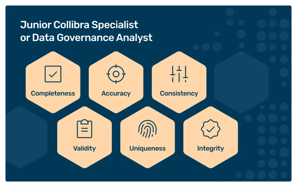
Collibra (and just about everyone in data management) calls out six key dimensions you need to tackle first.
Why these six? Because they’re measurable, actionable, and broad enough to cover most use‑cases. According to research quoted in Collibra’s article, only 3% of companies hit acceptable data quality (~97%+ across dimensions).
So if you nail these six, you’re already in the top tier.
1. Completeness
Missing data = blind spots. If your customer record doesn’t include phone, address, or email, your campaign, support, or billing efforts will inevitably become inadequate.
So, measure the percentage of required fields present in each record and highlight the gaps. It’s the fastest way to spot bad data..
2. Accuracy
Does your data reflect reality? If the birthdate or bank account info is incorrect, downstream systems and decisions will suffer.
Compare your fields against authoritative sources like public registries or trusted third-party APIs to spot real-world mismatches.
3. Consistency
Your CRM says “+48 123456789.” But the same record in your data warehouse drops the leading “+48”. Or the billing system has a different customer name…
Minor inconsistencies can escalate fast. Check that values match across systems to keep reports and pipelines aligned.
4. Validity
Does a ZIP code look like a ZIP code? Are dates in your preferred format? Invalid fields or malformed ones can break entire systems.
So, validate every field against your schema rules to catch format or domain violations.
5. Uniqueness
Is John Doe in the database once, or ten times? Duplicate customer records distort counts, budgets, and even churn analytics. Uniqueness checks ensure one record = one real-world entity.
6. Integrity
Here’s where attribute relationships matter.
Does every order point to an existing customer? Check for data integrity to make sure that the attributes are maintained correctly, even as data gets stored and used in diverse systems or changed at any point along the way.
How do you assess data accuracy and data integrity daily?
Data accuracy and data integrity are two of the more difficult dimensions to continuously monitor. But they’re also two of the most important for maintaining trust in the quality of your data.
Even light-touch, regular data checks can prevent the accumulation of low-quality data across systems over time.
Daily data accuracy checks
To assess accuracy regularly:
- Automate validations: Use scripts or data quality tools to verify values against reference data or expected ranges.
- Monitor anomalies: Sudden spikes or drops in key metrics can indicate accuracy problems.
- Involve domain experts: Have business teams periodically review sampled data to validate its correctness.
Daily data integrity checks
And here’s what to do for checking integrity:
- Run constraint validations: Make sure that primary and foreign key relationships are intact within your data warehouse or data storage systems.
- Check for duplicates and nulls: These are common data errors that often point to bigger issues with your pipeline or ingestion.
- Audit pipeline transformations: Check if no steps in your data pipeline are introducing inconsistencies or dropping critical fields.
Why is completeness the fastest way to measure data quality?
Among all the dimensions, completeness is arguably the most straightforward to implement and monitor. It answers the simple question: “Is all the data I expect actually there?”
Completeness is important because:
- You can measure it by simply calculating the percentage of missing fields in a dataset.
- Once you know where missing data lives, it’s often easy to trace it back to a source system or form.
- Incomplete data affects everything from customer profiles to machine learning features.
Improving the completeness of your data boosts trust in its quality almost instantly. Which is exactly why it’s a popular first target in any data quality initiative.
How can data observability help a data team ensure data reliability?
The term “data observability” refers to the tools and practices that allow teams to monitor, debug, and understand the health of their data systems.
In the same way application observability (like monitoring CPU and memory) ensures reliable apps, data observability ensures reliable data by offering:
- End-to-end visibility into data pipelines
- Alerting when anomalies, missing data, or schema changes occur
- Lineage tracking to trace data errors back to the source
- Metadata tracking to understand freshness, usage, and schema evolution
By integrating data observability into your tech stack, your data team can address data quality metrics before data reliability issues impact stakeholders. If you’re using Collibra, the platform’s Data Quality and Observability module will let you seamlessly tackle data quality issues with auto-generated rules and simplified deployment.
Collibra Data Quality and Observability. Source: Collibra
One of the important elements of data quality and observability is certifying your data. Here’s what Murdio’s data quality expert, Joanna Burzyńska, recommends:
Using SQL-based rules, you can create and assign data certificates in your Collibra data catalog, with information about who was responsible for profiling and who is the data steward. Data certification is the cornerstone of data stewardship and data governance – it simplifies auditability and compliance, and supports decision-making across the organization.
Joanna Burzyńska, Senior Systems Analyst, Murdio
What are the 12 data quality metrics to measure high data quality?
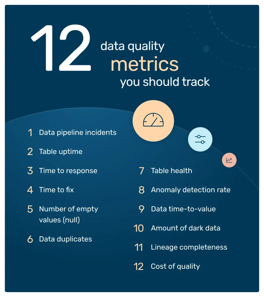
To build a robust data quality monitoring system, you can start with these twelve metrics across multiple dimensions, starting from more detailed metrics to more big-picture ones. These aren’t soft vanity KPIs, but concrete indicators that show whether your data is reliable, timely, and actionable.
Tracking important data quality KPIs can help uncover poor data, track improvements over time, and guide your overall data quality management strategy.
Note: The metrics we include in the list below are not all of the metrics you can and should measure, so adjust it to the needs of your organization. What’s important is to track the metrics that make sense for you and your goals.
- Data pipeline incidents: Every data outage, error, or quality issue counts here. It’s basic, but if it’s rising, you know something’s wrong.
- Table uptime: Percentage of time each key table or view is available and fresh. Think of this like system uptime, but for your data assets.
- Time to response (or MTTD, Mean time to detect): How quickly your team detects an event or error. Faster detection = smaller downstream impact.
- Time to fix (or MTTR, Mean time to repair): Once flagged, how long does it take to resolve problems? If incidents linger, it’s hard to maintain trust in data across the organization.
- Number of empty values (null): Empty values often suggest that critical information is missing or recorded in incorrect fields – which can, of course, have serious consequences downstream.
- Data duplicates: The percentage of duplicate records – which usually translates into storage costs, too.
- Table health: A composite score across completeness, accuracy, freshness, etc. It gives you a quick “good/bad” snapshot.
- Anomaly detection rate: Count or % of outliers or unexpected values that can negatively impact the accuracy, completeness, and reliability of the data.
- Data time-to-value: How quickly can your team convert data into business value? The response might disclose a great deal about the overall quality of your data.
- Amount of dark data: Dark data is data that your company collects and stores but doesn’t use in any way. In a recent global research survey, 60 percent of respondents reported that half or more of their organization’s data is considered dark. And this is often an indicator of underlying data quality issues.
- Lineage completeness: % of records with known and traceable origin. (You can read more about why lineage is important in this article: Data catalog vs data lineage.)
- Cost of quality: If you want to get buy-in to invest in data quality, you need to also be able to demonstrate the ROI for the business and the monetary costs the company incurs as a result of low data quality. (And according to Gartner, poor data quality costs organizations at least $12.9 million a year on average.)
How do you use data quality metrics to help improve the quality of dashboards?
Dashboards are only as trustworthy as the data they display. Low-quality data leads to misleading visualizations, faulty KPIs, and bad decisions. When you incorporate data quality metrics into the reporting layer, you give business users more confidence in the numbers they see.
To use data quality metrics to improve dashboards:
- Tag dashboard metrics with quality scores: Show confidence scores or alerts when the underlying data has known issues.
- Automate freshness checks: Don’t allow dashboards to display outdated data.
- Filter based on completeness: Hide or annotate charts with too much missing data.
- Log upstream errors: Surface data pipeline or ingestion errors that may affect chart accuracy.
Which tools and processes connect your data quality metrics to action?
Of course, metrics alone aren’t enough. You need the right ecosystem to take action.
Tools:
- Data observability platforms (like Collibra Data Quality and Observability) to easily monitor data health across pipelines
- Data quality frameworks (e.g., Great Expectations, Soda) to define, test, and report quality metrics
- Metadata management platforms to rack lineage and usage
- Data catalogs to connect quality scores to data assets
- Workflow orchestration to stop data pipelines on failure
Processes:
- Data quality SLAs, defining and enforcing quality expectations per system or use case
- Incident management, treating major data quality issues like production bugs
- Regular data reviews involving both engineering and business in quality assessments
- Ticketing integration, linking failed tests to Jira or Slack for follow-up
How do you build OKRs around data quality metrics and track progress?
What moves the needle for the business is tying data quality metrics to objectives and key results (OKRs) that align with business impact. This is where data quality becomes more than a back-office concern – it’s a growth enabler.
Here’s how to do it:
Start with the objective
Your objective should be clear and aligned with your business goals. For example:
- “Improve trust in analytics for better product decisions”
- “Eliminate revenue loss due to bad data in customer reports”
- “Reduce manual data firefighting and increase team velocity”
Notice the objective isn’t “have better data” (that’s simply too vague). It’s about why having better data matters.
Define measurable key results
Key results are where your data quality metrics come in. Choose 2-4 metrics that indicate meaningful progress toward your goal. For example:
Objective: Improve trust in customer analytics dashboards
Key results:
- Increase table uptime for core dashboards from 92% to 99%
- Reduce data incidents on BI reports by 50%
- Cut MTTR (mean time to resolution) from 3 days to < 12 hours
These are specific, measurable, and tied to business outcomes, such as trust, speed, and reduced downtime.
Track progress continuously
Don’t set and forget your OKRs. Embed them into your regular data quality assessment routines – weekly syncs, dashboard reviews, retros, etc. Bonus points if you automate tracking in tools like Collibra.
If a key result starts slipping, you don’t just log it – you investigate why:
- Is there too much missing data?
- Are key data sources down?
- Do you have enough test coverage on your data pipeline?
This is how OKRs shift you from reactive to proactive data quality management.
Pro tip: Tie OKRs to ownership
Assign each key result to a real owner. Your data team can’t improve what no one’s accountable for. You might assign ownership by domain (e.g., marketing data), by layer (e.g., warehouse health), or even by asset (e.g., lead scoring model).
When someone owns a result, it stops being “just another data quality issue” and starts being a measurable deliverable. That’s how you embed sustainable data quality practices into the fabric of your company, not just as hygiene, but as a competitive advantage.
What are the right metrics for sustainable data quality management?
Sustainable data quality management means building systems that can maintain high-quality data over time, without constant firefighting.
To achieve that, focus on:
- Leading indicators: Monitor pipeline health, data volume, schema changes
- Lagging indicators: Track actual downstream impacts (e.g., customer complaints, failed reports)
- Coverage metrics: How many data assets have quality tests in place?
- Resolution metrics: How fast are data errors being detected and fixed?
Equally important: don’t measure everything. Instead, align your metrics with business priorities. For example, marketing data may prioritize completeness and freshness, while finance focuses on accuracy and timeliness.
Final thoughts
Data quality metrics aren’t just technical tools – they’re business enablers. They turn vague concerns about “bad data” into actionable insights, help measure and resolve data quality issues, and build trust in the systems your organization relies on daily.
Whether you’re just beginning your data quality journey or scaling a mature program, the right metrics, tools, and processes can transform the quality of your data from a pain point into a competitive advantage.
Need support building your internal data quality program? Contact us at Murdio. We have certified data quality experts on board who can help you set up and scale your data quality efforts.
FAQs about data quality metrics
How often should we track and report on data quality metrics?
Ideally, daily or near-real-time for critical pipelines, especially if your team supports analytics or operational systems. Weekly or monthly reporting can work for non-critical assets—but the earlier you catch a data quality issue, the cheaper it is to fix. Automated monitors and alerts are your best friends here.
What’s the difference between data quality metrics and data quality KPIs?
Metrics measure, while KPIs prioritize. You might track dozens of data quality metrics (completeness, accuracy, table uptime…), but KPIs are the 2-5 that ladder up to business goals and are reported to leadership. For example: “95% of core dashboards must refresh on time” is a KPI based on uptime and freshness metrics.
About the Author

Share this article
Related Articles
See all-

19 May 2026
| Data QualityData quality in banking (2026): Navigating EU regulations, AI Act, and DORA
-

1 April 2026
| Data QualityData quality report: what to include and how to automate it in 2026 (enterprise perspective)
-

1 April 2026
| Data QualityData quality control: How to detect, block, and fix pipeline errors